Design a full exterior and interior concept for a next-generation performance EV targeting the premium segment. The brief asked for a vehicle that communicates speed and sustainability simultaneously — a visual language that feels distinctly electric without abandoning the brand's performance DNA.
The core tension in the brief was clear: performance EVs often look aggressive and angular, while sustainability-focused vehicles tend toward soft, approachable forms. We needed a third way — a design language that expressed both without compromising either.
Before a single line was drawn, we spent four weeks immersed in the competitive landscape, target customer profiles, and the brand's design heritage.
We benchmarked 14 production and concept EVs, identifying recurring visual clichés — the closed-off grille, blue accent lighting, and exaggerated aerodynamic addenda. Our research revealed an opportunity: most performance EVs look like they're trying too hard to look electric. Our target customer — educated, 35–50, financially independent — wanted sophistication over spectacle.
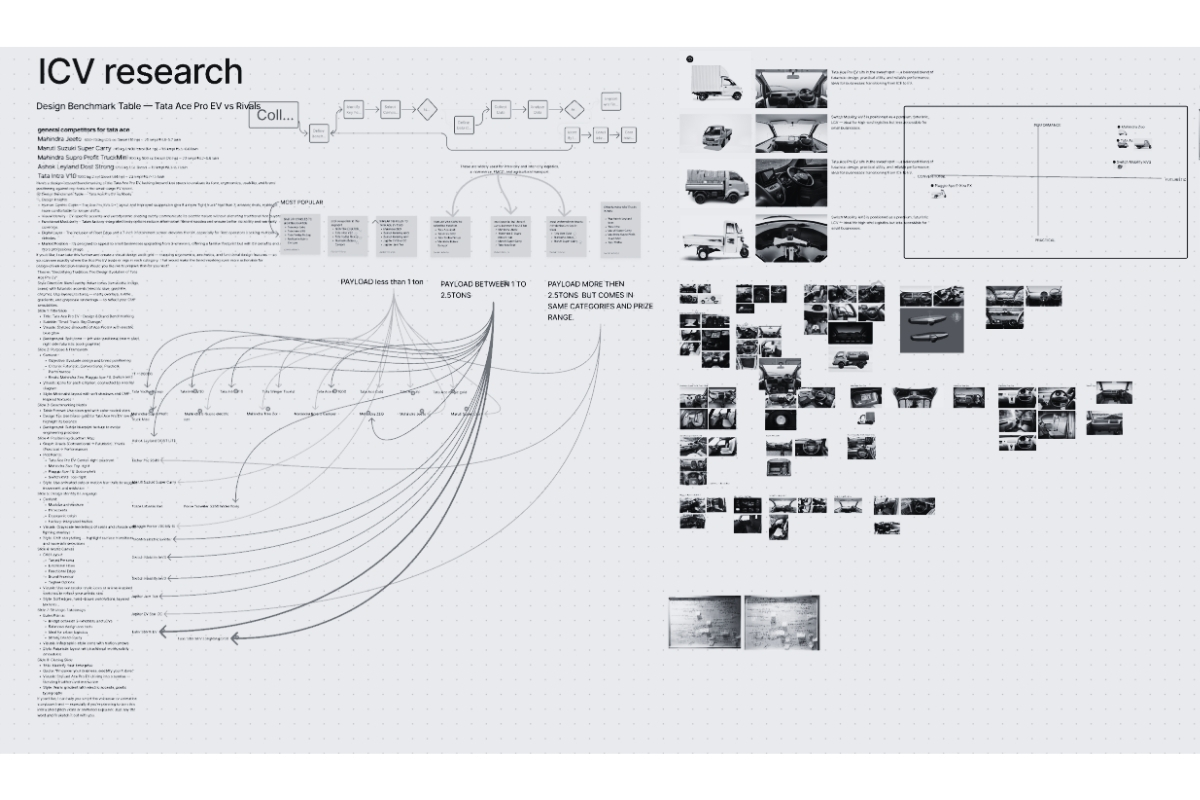
Competitive benchmarking across 14 EV concepts and production models

Target customer persona development — three distinct profiles identified
Three distinct design directions emerged from two weeks of intensive sketching — each representing a different philosophical interpretation of the brief.
Direction A — 'Tension' — used taut, sculpted surfaces with strong graphic shut lines. Direction B — 'Flow' — explored continuous surface language inspired by fluid aerodynamics. Direction C — 'Restraint' — a minimal, almost industrial approach that let proportion do the work. After an internal review, Direction A was selected for development with surface ideas borrowed from Direction C.
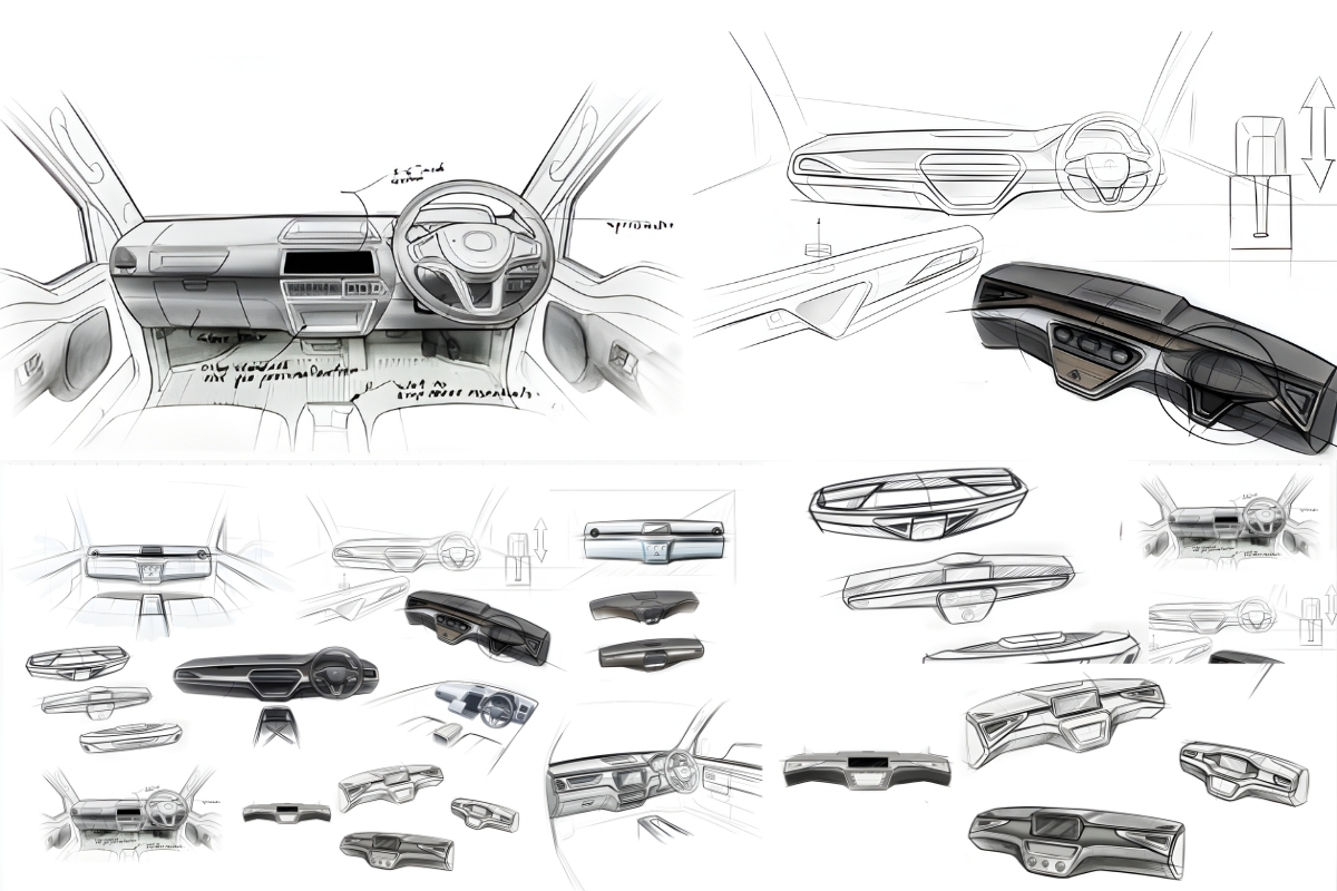
Early sketch exploration — over 200 sketches across three design directions
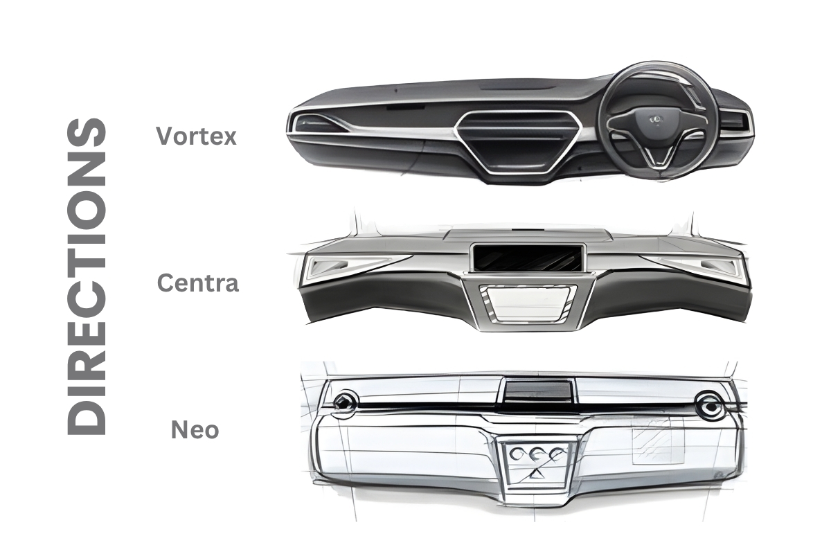
Direction review board — A, B, and C presented to stakeholders
For most owners, this cabin isn't just a workspace — it's the vehicle that represents years of work, and often a visible step forward. We wanted the CMF story to carry that weight quietly: durable enough for the job, considered enough to feel like something worth being proud of.

The driver's day
Long shifts, small comforts, a cabin lived in.

What ownership means
A vehicle worth being proud of.
How small choices carry weight
Five combinations, each answering a different version of the same question: what does it feel like to sit in this cabin for ten hours, and what does it say about the person who owns it?
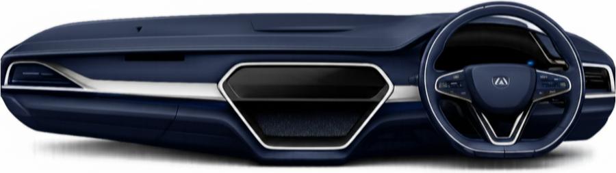
Step 01
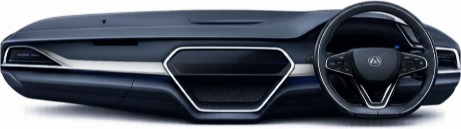
For many drivers, this cabin is the most personal space they own — more than a workspace, it can be a marker of how far they've come. Navy carries that weight without shouting about it: composed, durable, the kind of tone that still looks like a step up five years and ten thousand shifts later.
Step 02
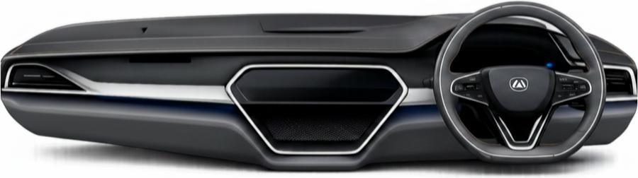
Not every driver wants to be told what to feel about their cabin — some just want it to look considered, not cheap. Graphite is quiet dignity: the tone that lets a driver feel their vehicle was designed with care, without asking for attention it hasn't earned.
Step 03
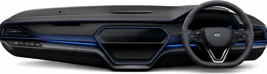
A cabin a driver spends ten hours a day in shouldn't feel cold. The warm piping running through steel grey is a small, deliberate act of care — proof that comfort was considered, not just durability.
Step 04
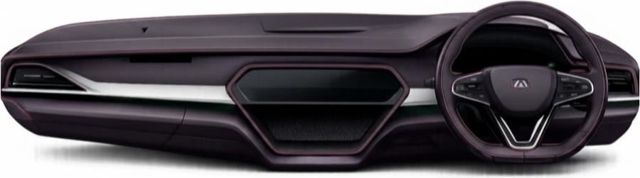
For the driver starting before sunrise, midnight blue is a small acknowledgement that someone thought about that hour — specifically theirs. The backlit trim isn't decoration; it's a quiet form of respect for a shift most designs forget exists.
Step 05
Reaching a supervisor route or a flagship vehicle is a milestone worth marking. Maroon edge exists for that moment — a visible, earned distinction, not just a different colour, but a sign of where a driver has arrived.
